MDSTUDIOS
What is MDSTUDIOS?
Artist Showcase Website – A personal website designed to present Christina De La Cruz’s interdisciplinary work, including fine art, digital pieces, and sculpture
Seamless Buying & Inquiry Experience – The site allows visitors to explore artwork, learn about Christina’s practice, and easily purchase prints or contact the artist for commissions
Accessible and User-Friendly Design– Built to provide a clear, inviting way for fans, collectors, and potential clients to engage with Christina’s work on both desktop and mobile devices
Background
Christina De La Cruz needed an online portfolio that not only showcased her interdisciplinary artwork but also made it easier for visitors to explore, purchase, and connect with her. Existing solutions lacked a tailored experience that reflected her artistic identity while providing clear pathways for inquiries and sales.
Research Goals
To understand how potential buyers and fans engage with an artist’s website and identify opportunities to improve the browsing, purchasing, and contact experience. The goal was to create a site that balances artistic storytelling with user-friendly functionality.
Objectives
1
Add an online shop
Online store to sell original paintings, prints, and sculptures
Features: categories, product details, and a secure checkout.
2
Integrate a booking system
Clients can book consultations or commissions through an embedded calendar
Choose dates/times based on the artist’s availability.
3
Maintain portfolio functionality
Keep the portfolio as the visual centerpiece of the site
Ensure easy browsing and focus on showcasing Christina’s work
4
Improve Usability & Aesthetic
Deliver a visually unified and artistically reflective design
Create an intuitive, visitor-friendly interface
Competitor Analysis
2. User Interviews
To guide the redesign of the MDStudios portfolio site, I conducted interviews with both artists and art buyers. The goal was to identify pain points and uncover ways to improve how art is showcased, sold, and commissioned online. These conversations shaped the key priorities for streamlining sales, improving transparency, and creating a more user-friendly experience.
Understanding Artists' and Buyers' Needs for a Modern Portfolio Site
Findings (interviewed 5 users):
Common User Needs: Clear pricing, availability, and purchase process, easy navigation and fast load times, high-quality visuals to preview artwork
Motivations: Artists want efficient, structured sales and commission processes, buyers want transparency and confidence before purchasing
Pain Points: Confusing purchase steps, unclear pricing, slow communication, overwhelming or cluttered site layouts, difficulty previewing or visualizing artwork in detail
Desired Experience: Seamless e-commerce and booking systems, a balance of aesthetics and usability, clear, trustworthy, and efficient interactions
Impact: Greater satisfaction and trust from buyers, reduced manual workload for artists, increased sales and commission inquiries
Affinity Mapping
Color-coded the key insights from each interview to reveal any patterns.
Separated the patterns into 6 groupings
Key Insights
Artists struggle with managing sales and inquiries manually, leading to lost opportunities and extra back-and-forth communication
Buyers are frustrated by unclear pricing and commission processes, which creates hesitancy and slows down transactions
Both artists and buyers value simplicity, automation, and transparency in the purchase or commission experience
Product presentation is crucial — buyers want clear visuals, detailed descriptions, and preview tools to feel confident purchasing artwork online
Artists desire websites that balance modern design with functionality, prioritizing ease of navigation, speed, and minimal clutter over visual complexity
Moving Forward
Based on these insights, the next steps will focus on creating a streamlined e-commerce experience with clear pricing, a structured commission request system, and enhanced product visuals. The site will feature a modern, minimalist design that prioritizes usability, quick navigation, and automation to reduce manual tasks for artists. These improvements aim to build buyer trust, boost sales, and create a more efficient, user-friendly platform for both artists and collectors.
3. Define
Clarifying the User’s Needs and the Core Problem
User Needs: Artists and buyers need a platform that simplifies sales, provides pricing transparency, and enables a smoother commission and purchasing process without manual back-and-forth communication.
Personas & Empathy Maps: Two primary personas shaped the direction of this project
Alejandro Torres – An emerging digital artist seeking a professional, automated sales platform.
Claire Bart – An art enthusiast who values clear pricing, easy purchasing, and trustworthy, polished websites.
Problem Statement: Managing art sales through social media DMs is inefficient, and unclear pricing or commission processes frustrate both artists and buyers. There is a need for an integrated, easy-to-navigate portfolio website with e-commerce, transparent pricing, and streamlined commission requests.
Persona 1:
This user represents an emerging digital artist who wants to simplify sales, automate processes, and present a more professional image to buyers. Alejandro struggles with managing inquiries through social media and wants a direct, hassle-free way for buyers to purchase or commission work.
Persona 2:
This user represents a buyer who loves collecting art but finds current artist websites confusing and lacking in transparency. Claire seeks a smooth, professional shopping experience with clear pricing, easy purchasing options, and visual tools to preview artwork.
4. Prioritization
Generating and Prioritizing Solutions for User Needs
Project Goals
User Flows
Feature Set
5. Prototype
Transforming Insights into Interactive Solutions
Wireframing: Built low-fidelity wireframes to explore how artists could showcase their work, sell pieces, and manage commissions through a clean and intuitive layout. These wireframes prioritized clarity, pricing transparency, and ease of navigation for both artists and buyers.
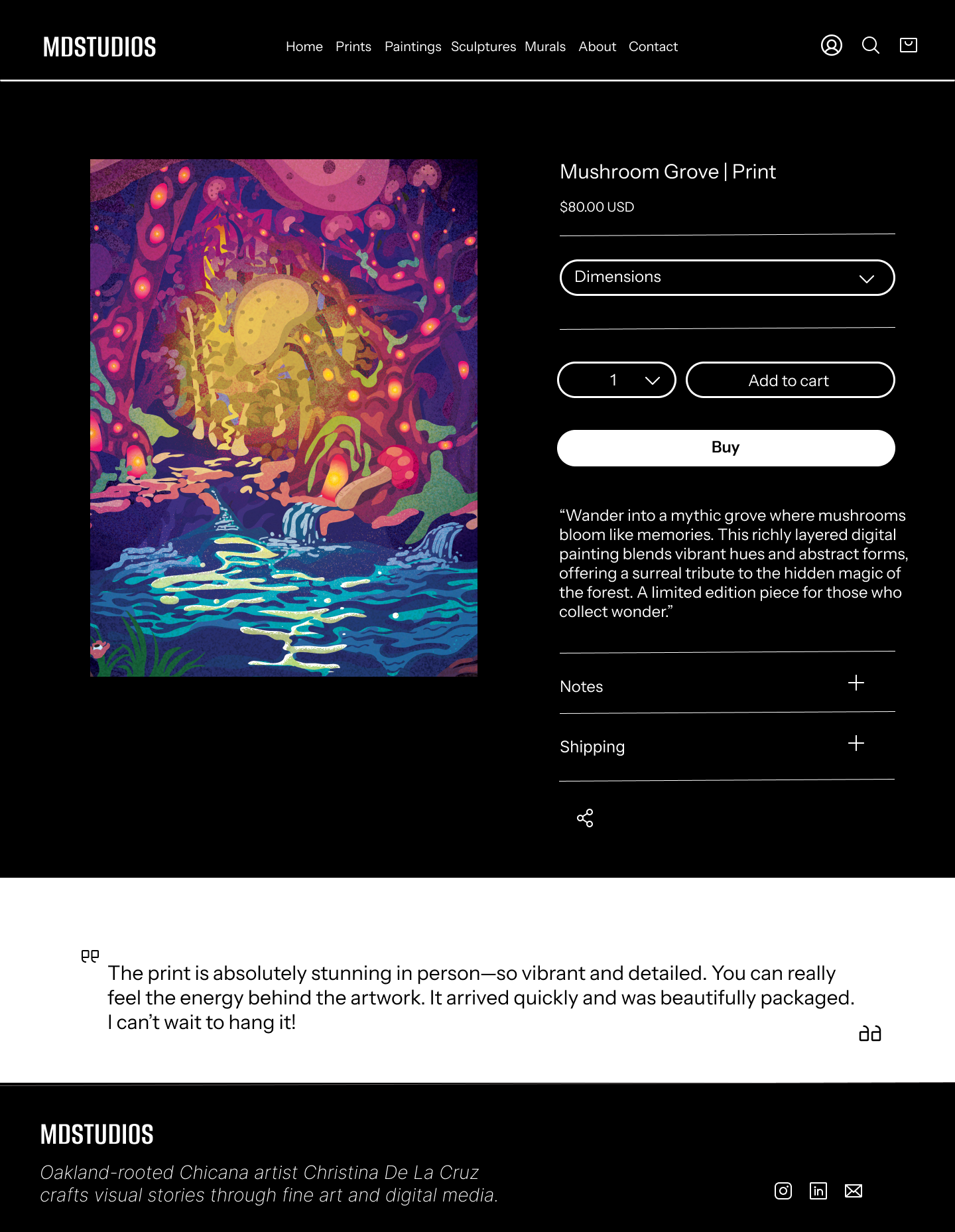
Refinement: Developed high-fidelity mockups that focused on creating a professional and user-friendly site. Key features included a streamlined shop page, detailed product views with mockup tools, a structured commission request form, and a modern layout that reflects the artist’s unique style.
Lofi Wireframes
Mobile
HiFi Wireframes
6. Testing
Validating the Design with Usability Testing
Usability Testing: Ran moderated usability tests to assess how easily artists and buyers could navigate the site, explore artwork, request commissions, and complete purchases. Feedback revealed friction points around page clarity, product details, and booking flow.
Iterative Improvements: Refined copy to improve transparency, added clearer buttons and form fields for the commission process, and simplified the layout to reduce visual noise—resulting in a smoother, more intuitive experience for both buyers and artists.
User Testing Summary
Five moderated usability sessions were conducted on both desktop and mobile devices to assess the clarity, trustworthiness, and overall functionality of the artist’s high-fidelity portfolio site. Participants were asked to complete core tasks such as browsing artwork, viewing product details, learning about the artist, and booking a consultation.
Key Insights
Users responded positively to the site’s clean layout, visual hierarchy, and overall artistic tone.
Image-based navigation was preferred over traditional menus, reinforcing the importance of a visual-first design.
The white background supported contrast but felt too stark to some, especially in low-light settings.
Minor usability gaps were observed in the About and Booking pages due to dense copy and lack of feedback cues.
User Feedback Insights
“I’d buy from this site, it feels professional and polished.”
“I prefer browsing through the artwork directly, text menus slow me down.”
“The About section has great content, but it’s hard to skim.”
“I wasn’t sure if my booking went through, there was no confirmation message.”
“The white background feels harsh, maybe add a darker mode or toned option.”
Opportunities
Improve Trust Signals: Add press mentions, testimonials, and a downloadable artist CV to reinforce credibility.
Enhance Product Details: Include artist’s notes, media format toggles, and “view in room” previews.
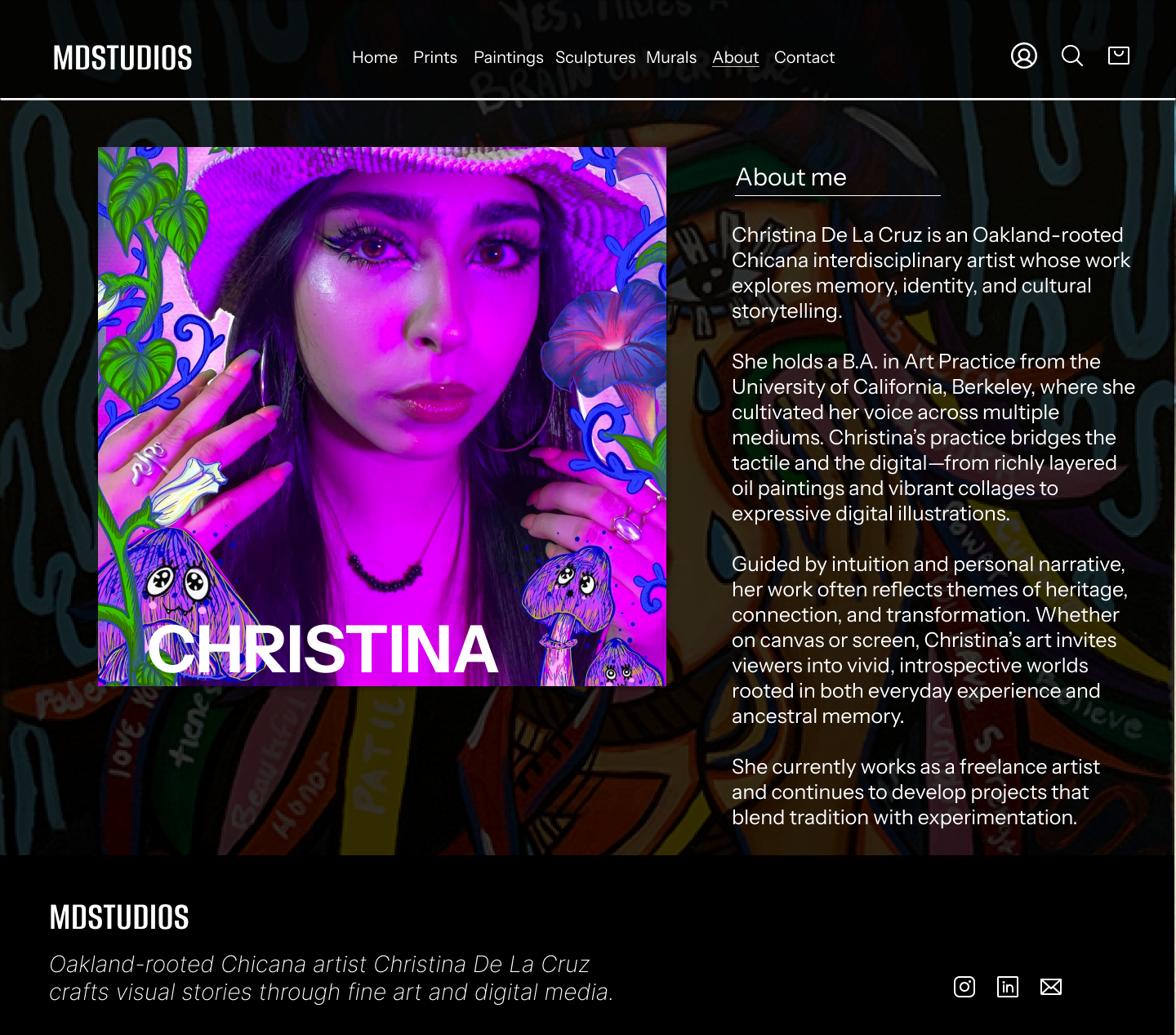
Refine About Section: Break up copy with quotes, visuals, and past project highlights.
Strengthen Booking Flow: Add confirmation messages, email receipts, and clearer step-by-step labeling.
Offer Visual Comfort: Explore optional dark mode or a toned background for better visual comfort.
Conclusion
User testing confirmed the site’s strong visual appeal and intuitive navigation, especially for visually driven users. Feedback revealed key areas for improvement, most notably around trust-building elements, clarity in booking interactions, and enhancing content scannability. These refinements helped create a more seamless and credible experience for both art buyers and commission clients.
7. Iteration
Refining the Design Based on User Feedback
During usability testing, users responded positively to the overall flow and aesthetic of the artist’s website. However, key areas emerged for improvement, particularly around: artwork presentation, site trust signals, and booking confirmation clarity.
Main Feedback:
“The art looks great, but I wasn’t sure if I submitted the booking form—it didn’t confirm.”
“The text on the About page feels a little long. Can you break it up?”
“I’d love to know more about the artist’s process or see how they work.”
“It’s clean, but the white background is really stark on my screen.”
“Zooming in or seeing how it would look in a room would help me decide.”
Design Iteration Focus:
Homepage Enhancements
Replaced long filter category labels (e.g., “Filter by Mood”) with short titles or icon-only buttons.
Artwork Detail Pages
Included “Artist’s Notes” for selected pieces to describe the process and story behind the work.
Planned a toggle to preview digital vs. physical format and a future “View in Room” feature.
About Page Updates
Broke long text into sections with quotes and added a new “Show & Process” area to highlight behind-the-scenes moments, exhibitions, and the artist’s studio space.
Booking Confirmation Flow
Added visual indicators and confirmation messaging to reassure users that their inquiry or request was submitted successfully.
Conclusion
Feature-Driven Design: This project introduced a smart playlist creation tool, improving the user experience by making music organization faster and more intuitive.
User-Centered Tool: By focusing on real listener habits and frustrations, the feature helps users curate playlists based on mood, genre, or activity — all with minimal effort and maximum personalization.


