

CleanCheck
What is CleanCheck?
Ingredient Transparency App – CleanCheck is a mobile app designed to help users make safer and more informed skincare and cosmetic choices by scanning product barcodes and instantly displaying ingredient safety ratings
Personalized Safety Insights – The app provides clear ingredient breakdowns, potential irritants or allergens, and tailored recommendations based on user skin sensitivities and preferences
Empowering Conscious Consumers – CleanCheck aims to simplify the research process for beauty shoppers by delivering user-friendly safety scores, ingredient tips, and daily education, all in one place
Background
CleanCheck was created in response to the growing demand for ingredient transparency in skincare and cosmetics. Many consumers struggle to understand product labels and assess potential risks, especially those with sensitive skin, allergies, or specific health concerns. Existing tools were either too technical or too generic. CleanCheck bridges this gap by offering a mobile-first solution that simplifies ingredient data and empowers users to make safer, more informed choices.
Research Goals
The goal was to understand how users currently evaluate skincare and cosmetic products, what safety concerns they have, and how they seek information while shopping. The research aimed to uncover pain points in the decision-making process and design an app that delivers quick, personalized ingredient insights in an intuitive and approachable format.
Objectives
1
Simplify Ingredient Education
Design a platform that helps users quickly understand what ingredients are in their beauty products, what they do, how safe they are, and whether they align with the user’s personal preferences or sensitivities
2
Build Trust with Clear Safety Scores
Integrate a transparent scoring system that breaks down ingredient safety in a digestible format, using visuals and plain language to reduce confusion and fear-based decision making
3
Personalize the Experience portfolio functionality
Allow users to input concerns (e.g. sensitive skin, allergies) and receive tailored product insights, tips, and alternative suggestions to support smarter, safer skincare choices
4
Make the Experience
Delightful & Mobile-First
Ensure the interface is intuitive, visually calming, and optimized for mobile use, empowering users to scan, search, and save product info on the go with minimal friction
Competitor Analysis

2. User Interviews
To inform CleanCheck’s design, I conducted interviews with five beauty consumers to better understand their habits, concerns, and motivations around ingredient transparency and product safety. The goal was to uncover pain points in how people research cosmetics and make informed buying decisions. These conversations guided core priorities such as improving ingredient clarity, building trust in safety scores, and creating a streamlined experience for discovering safe, personalized products.
Understanding Consumer Needs Around Ingredient Awareness and Product Safety
Findings (interviewed 5 users):
Common User Needs: Simple ingredient definitions, clear safety ratings, ability to personalize product matching, fast scanning features, and an intuitive way to browse and compare items
Motivations: Users wanted to avoid ingredients that trigger skin reactions, align products with their personal values (e.g. clean beauty, cruelty-free), and feel confident in the safety of what they apply to their skin
Pain Points: Users found current solutions time-consuming, full of jargon, and lacking personalization. Many relied on scattered research from multiple sites or had to manually read long ingredient labels
Desired Experience: A centralized app that educates while making product discovery simple, combining clarity, safety, personalization, and a sleek, modern interface
Impact: These insights shaped CleanCheck’s core features such as the safety score system,“Tip of the Day,” and the ability to match products to skin sensitivities, helping users shop with confidence and ease

Affinity Mapping
Color-coded the key insights from each interview to reveal any patterns.
Separated the patterns into 6 groupings

Key Insights
Ingredient confusion is common — users often feel overwhelmed by scientific or unclear ingredient names, leading them to search externally for information
Personalization is essential — users want results tailored to their specific skin types, sensitivities, and goals
Alarmist language creates distrust — users are turned off by fear-based messaging and prefer contextual, science-backed explanations
Tool usability matters — users desire simple, visual features like label scanning, side-by-side comparisons, and quick definitions
Credibility is key — users trust information backed by dermatologists or research, not influencers or vague ratings
Timing is crucial — users primarily rely on the app while shopping or right before making a purchase, often wanting quick reassurance
Moving Forward
To better support users in making confident, informed product choices, the next design phase will focus on enhancing ingredient clarity, personalization, and trust. We will prioritize adding visual learning aids (e.g., icon cues, safety scores, and tooltips), simplifying ingredient explanations, and tailoring recommendations based on skin type and sensitivities. Future iterations will also explore educational modules like “ingredient of the day,” and reinforce credibility through medically reviewed content and expert-backed information. These improvements aim to reduce overwhelm, build user trust, and position CleanCheck as a go-to tool for safe and easy cosmetic shopping.
3. Define
Clarifying the User’s Needs and the Core Problem
User Needs: Health-conscious users and parents need a reliable tool that helps them make informed skincare product decisions quickly and confidently. They seek ingredient clarity, trustworthy recommendations, and a way to avoid hidden irritants without relying on fear-based messaging or complicated research.
Personas & Empathy Maps: Two primary personas shaped the direction of this project
Emi Rodriguez – A medical assistant with sensitive skin and allergies, who wants personalized, science-backed safety feedback when shopping for skincare.
Rosa Jenkins – A mother managing eczema who prioritizes safety, transparency, and simplicity while shopping for herself and her daughter.
Problem Statement: Skincare shoppers often struggle with confusing ingredient labels, vague marketing claims, and limited personalization. This leads to frustration, wasted time, and hesitancy during purchase decisions. There is a need for a tool that demystifies ingredients, provides context-driven recommendations, and empowers users to choose safe products aligned with their unique needs.
Persona 1:
This user represents a health-conscious individual with sensitive skin who often feels overwhelmed by skincare product labels. Emi wants a clear, science-backed way to check if a product is safe for his skin, without needing to decode long, complex ingredient lists. He values transparency, personalization, and guidance rooted in dermatological credibility.

Persona 2:
This user represents a protective parent managing sensitive skin conditions (eczema) for both herself and her child. Rosa is cautious and avoids anything with vague or misleading claims. She seeks peace of mind when shopping, favoring tools that offer trustworthy, digestible ingredient summaries and help her confidently assess product safety.

4. Prioritization
Generating and Prioritizing Solutions for User Needs
Project Goals

User Flows

Feature Set

5. Prototype
Transforming Insights into Interactive Solutions
Wireframing: Built low-fidelity wireframes to explore how users could quickly scan skincare products, receive ingredient explanations, and personalize results based on sensitivities or concerns. These early wireframes focused on clarity, ease of use, and empowering users to make informed product decisions, especially at point-of-purchase moments.
Refinement: Developed high-fidelity mockups emphasizing a clean, trustworthy, and intuitive interface. Key features included a real-time ingredient scanner, color-coded safety indicators, a “click-to-learn” explanation tool, and the ability to filter based on personal preferences. The design aimed to reduce fear-based messaging, build user confidence, and support safer shopping experiences.
Lofi Wireframes

HiFi Wireframes


6. Testing
Validating the Design with Usability Testing
Usability Testing: Conducted moderated usability tests to evaluate how easily users could navigate CleanCheck’s key features: scanning products, interpreting ingredient safety, reviewing match results, and saving favorites. Feedback highlighted strengths in visual design and clarity, while also revealing opportunities to improve tap interactions, match explanations, and context around personalization.
Iterative Improvements: Refined copy to better explain ingredient safety and match logic, added visual cues to make tappable elements more intuitive, and streamlined page layouts to reduce friction. These enhancements helped create a more seamless and informative experience, empowering users to make confident product decisions, especially in fast-paced shopping environments.
User Testing Summary
To evaluate the usability and effectiveness of the CleanCheck iOS app, I conducted five moderated tests with users who had varying skincare needs and tech habits. The focus was on core user flows: Home, Scanner, Scan Results, and Favorites, along with interpretation of ingredient safety and personalization features. The goal was to uncover how intuitive and informative the experience felt, especially in fast-paced, real-world scenarios like in-store shopping.
Key Insights
Navigation is Intuitive
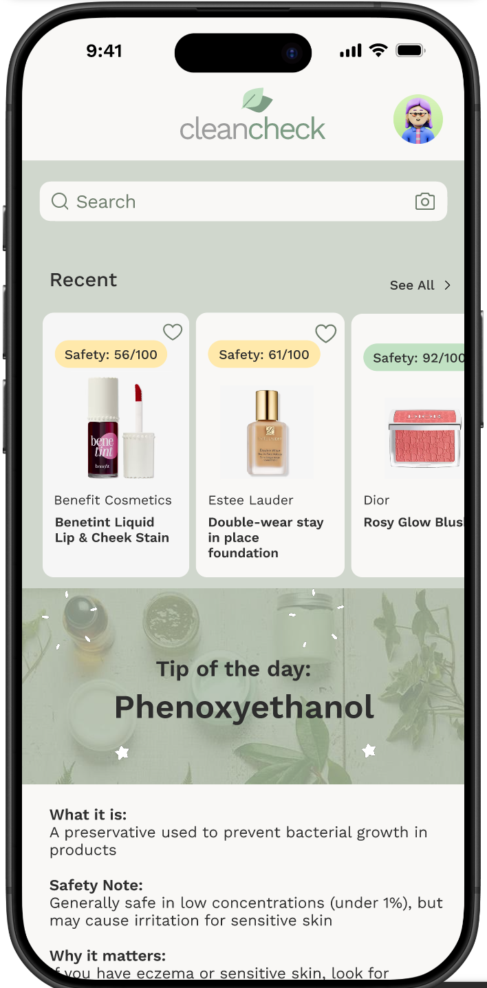
All users completed tasks without guidance, indicating strong layout clarity. The scanning feature felt familiar and accessible across varying user types.Safety Ratings Build Confidence
The color-coded safety score and simplified ingredient list resonated strongly. Labels like “Excellent” and “Caution” helped users feel informed and empowered.Users Want Just Enough Context
While users liked short summaries and visual indicators, they also desired brief explanations—especially for match results and ingredient tap areas.Favorites Flow is Clear and Enjoyable
The heart icon was recognized instantly. Users mentioned wanting more ways to organize or share their saved products.Feature Interest Extends Beyond At-Home Use
Users expressed interest in using CleanCheck while shopping in-store, reinforcing the app’s value for quick, confident decision-making.
User Feedback Insights
Home Screen:
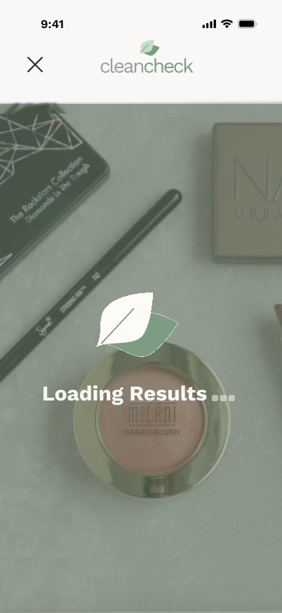
Users gravitated toward the scan button and appreciated the "Tip of the Day" as a friendly, educational touch.Scan Function:
Interface felt clean and efficient. Barcode scanning was seen as a must-have and felt familiar to all testers.Scan Results:
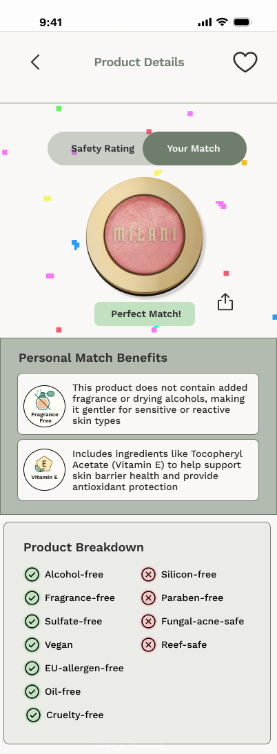
Everyone understood the safety score visually. However, some users wanted clarity on how it was calculated or what made an ingredient “good.”Ingredient + Match Info:
Many tried to tap ingredients expecting more details. The "Perfect Match" badge drew attention, but users needed an explanation for why something was a match.Favorites:
Easy to use. Some users suggested features like reordering saved products or sharing with friends.
Opportunities
Improve Tap Interactions
Add visual cues or animations to make it obvious that ingredients and badges are tappable. Consider hover/tap effects or (+) icons.Add Context to Personalized Match Results
Users wanted to know why a product was marked as a match. A short tooltip, sentence, or “Why this?” link could clarify this feature.Expand Favorites Functionality
Features like pinning top favorites, reordering, or sharing with others (especially family) could deepen engagement.Enable Comparison Tool
One user expressed interest in comparing two scanned products side by side, which could be especially helpful for decision-making in stores.
Conclusion
The CleanCheck lo-fi prototype successfully conveyed the core value of quick, personalized ingredient transparency. Users appreciated its simplicity and felt confident navigating the tool independently. By adding more visual feedback, minimal contextual explanations, and small interaction cues, the next iteration can increase clarity and user trust, especially in real-time shopping environments.
7. Iteration
Refining the Design Based on User Feedback
During usability testing, users responded positively to the overall flow and clarity of the CleanCheck app. Participants found the app intuitive and appreciated features like the Tip of the Day, visual ingredient summaries, and favorites functionality. However, key opportunities for improvement emerged around tap interactions, match labeling clarity, and UI polish.
Main Feedback:
“I’d tap on the ingredient name expecting more info.”
“What does ‘Perfect Match’ mean? Why is it perfect for me?”
“The heart icon makes sense, it’s what I’d expect.”
“This feels clean and easy. I’d totally use it at Target.”
“A compare feature would be helpful.”
Design Iteration Focus:
Match Label Clarity
Updated “Perfect Match” badge with a tooltip-style info icon
Linked the badge to a short explanation on how the match is determined
Visual & UI Polish
Removed unnecessary outlines and borders for a cleaner aesthetic
Reduced logo size for better visual balance
Created a short& animated GIF prototype for smoother transitions and shareable presentation
Conclusion
Feature-Driven Design: CleanCheck empowers users to make safer skincare decisions by simplifying complex ingredient data into clear, actionable insights. Core features like color-coded safety scores, ingredient summaries, and match-based recommendations were developed directly in response to real user needs.
User-Centered Tool: Rooted in personal skincare habits and frustrations, CleanCheck prioritizes ease of use and clarity. Through continuous testing and iteration, the app became a trusted tool for users to scan, save, and compare products confidently—whether shopping online or in-store.